


The Society Spring Exhibition was held at Leura Fairways, 19-21 Fitzroy Street, Leura from October 4th to 12th, in conjunction with the Leura Gardens Festival.
The Exhibhition was judged by the well known local artist David Newman-White, and the prize winning paintings are shown below with the judge's comments on all the award winning paintings.
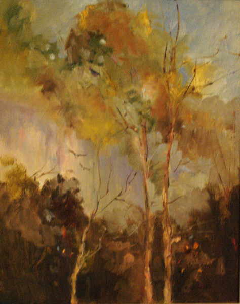 |
Section 1, Oils: First Prize: "Through The Trees", by Ruth Dengate Shades of Conder, English Expressionist artist who painted with contemporaries Tom Roberts and Frederick McCubbin in the late 19th Century. Ruth gives a contemporary feel to the landscape without being seduced by colour or frivolous detail. Second Prize: "Late Afternoon, Kiama" by Helen Hudson Enjoyed the high key balanced against the low key. Here the cold reality of the landscape reminds me of Casper David Friedrich's paintings. The stark contrast of foreground to distance cameo's the landscape skilfully. Highly Commended: "Megalong Creek" by Alfred Blakers Like the way this painting relinquishes detail for the higher qualities of light and shade. No overriding of colour. The focus remainson the elements of the landscape - water, earth and sky. Commended: The New Shoes" by Marlene Strathdee Composition in reds and greens. The colours pulsate from the distance. Marlene's vocabulary has turned to paint and colour in this one, subordinating the subject "The New Shoes". Mary Cassatt has a similarcomposition in blues and oranges withb her study of a young child reclining in a large chair; the tartan is blue, the chair is blue.
|
 |
Section 2, Acrylics First Prize: " 'Merrygarth' at Mt. Wilson" by Lia Johnston Good composition and structure: - underlying geometric shapes; - overlaid with organic brush strokes / lush application; - hidden vortex - Fibonacci proportion and balance. Second Prize: "Turon 1" by John Marsh Elements of Fred Williams / Cezanne / Georgia O'Keeffe. Freshness of colour and paint application, considered brush strokes, restrained use of colour. Reference: Georgia O'Keeffe's landscapes. Highly Commended: "The Pleasure of Plants" by Richard Grammer. Shades of Monet / Kevin Connor. Beautiful Viridian green. Layered colours giving subtle delivery and balance of palette. Commended: "My Garden Flowers" by Ann Warnes No room to move visually / well balanced. Monet influence |
 |
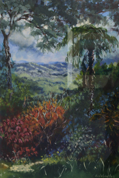
Section 3, Watercolours First Prize: "Where Lyrebirds Dwell" by Marie Morris Simply magic. Poetic. very sensitive application. markmaking reminiscent of Tim Allen's in which he produces a 'felt' landscape, a landscape once walked through, the memory, the experience seen as much through recollection as through representation. Second prize: "To The Sea" by Heather Skarratt Shades of Cezanne / the mountain on the left does it for me; brings my mind back to Cezanne. Reminds me also of the bold landscapes in the AGNSW done by Streeton and Ashton. Sweeping planes broken into a patchwork blanket of fields. Highly Commended: "Last Trams Across The Bridge" by Dennis West Precise / love the trams / enjoy the application of watercolour in the Harbour Bridge - loose, accidental helps to balance the Apollo. Dorrit Black: documentation of Harbour Bridge. Grace Cossington-Smith: Harbour Bridge. Commended: "Light And Shadow from Sofala Road" by Esther McFarlane Love the zigzag entry to the composition, which pulls the eye right into the composition. Clouds and theirshadows balancing the light and shade. Hilda Rix-Nicholls landscapes, Australia's lovely rolling hills. Still insists on fencing off the front of the painting, this time shielded by the long grass which gives enough relief from the near horizontal line of the fence. |
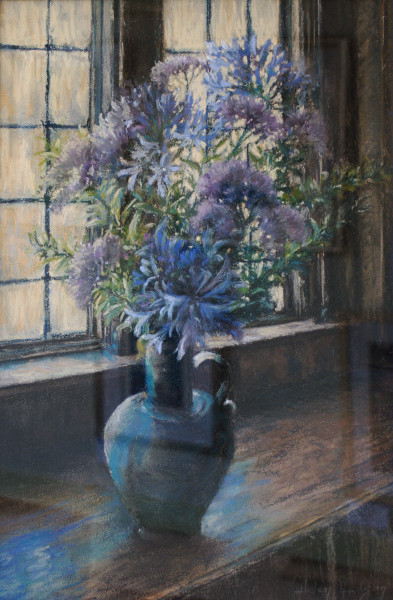 |
Section 4, Works on Paper First Prize: "By The Sunlit Window" by Helen Hudson Recollecting Margaret Olley's subtle use of colour, light and shade. Close viewing offers intensely rich, warm cornflower blues offset by the green blue of the vase. Nice use of reflection. Beautifully felt pastel application. Second Prize: "Spring" by Valerie Craven Claude Monet like infusion of colour. Cools and warms undulate before the eye. An element of Jon Cattapan introduced by the incluion of linear drawing within the composition which dissolves when viewed from a distance, where the medium overrides the subject. Highly Commended: "Cat Grooming" by Richard Grammer Minimal and effective; Cats French artist speciality - Eugene Delacroix rear end of a cat; Daumier: the view nobody wants to see. Richard's is far more. Commended: "Little Fish" by Joy Dennis Medium and colour in balance. Application precedes the subject. |
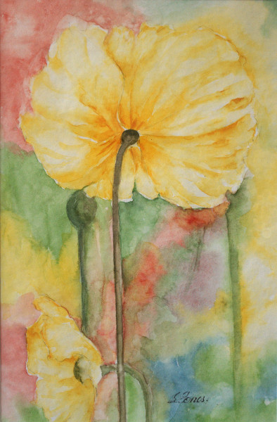 |
Section 5, Small Paintings First Prize: "Poppies" by Shirley Jones Flower paintings by Georgia O'Keeffe, American minimalist. O'Keeffe has a strong emphasis on female gender in her paintings / watercolours. - Delicate, soft - Composition is not overtaken by detail - Colour dissolves into the bacground. Second Prize: "Blue Mountains Cottage" by Helen Hudson Enjoyed markmaking and layering. Highly Commended: "Black Cat: by Jen Ross Brown Fine mosaic of colour. Needs close inspection to appreciate a little gem! Commended: "Marshland" by Maunie Kwok Wet on wet application / division of space, square to rectangle. Blue dissolving in to a yellow sky at the horizon. |
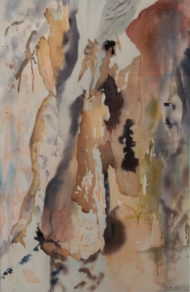 |
Section 6, Beyond Reality First Prize: "Jenolan Mystique" by Irene Jenkins Has moved beyond representational reality to the language of paint and abstraction. Floating forms are not a problem in this section. New York School Mark Rothko sits comfortably with the soft edges of bark, rock and plant. Picture mainatins lyrical integrity. Second Prize: "Travelling West" by Barbara Pankhurst Sometimes colour and light need to come to the fore. The flatness of the black silhouette in the form of trees emphasizes the negative shapes and colours. When looking at this piece it works best when you focus on the negative; then the colour bursts forth. Similar lessons in Piet Mondrians's paintings. Highly commended: "Reverie" by John Marsh Beautifully conserved landscape' a wonderful collage of colour in its' restrained way. Picasso quite often used neutral tones to evoke more from a soft arrangement of colour. Commended: "Unrequited Passions" by Mara Jordan Attention to male breasts in this picture. |